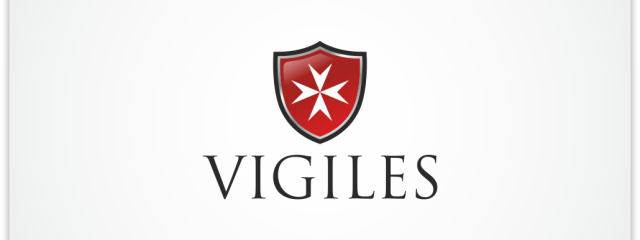
I designed this logo long time ago, and it was recently sold via stocklogos.com. Logo was bought by an Austrian company, which will offer different services, such as: professional chauffeur services, private investigations, fire protection and potentially also the transport of explosive and radioactive goods. The Vigiles or more properly the Vigiles Urbani („watchmen of the City”) were the fire-fighters and police of Ancient Rome. Additionally, I used the shield in the logo, which is common representation of the protection and I also used the basic shape of Maltese cross, commonly used by fire-fighters. The cross is eight-pointed and has the form of four „V”-shaped elements, each joining the others at its vertex, leaving the other two tips spread outward symmetrically. The eight points also symbolize the eight obligations or aspirations of the knights.Continue Reading
ArchivesPosts Tagged ‘shield’
23lutLogo for The United States PRE Breeders Association

Today I’d like to present the logo designed for The United States PRE Breeders Association (USPREBA). It’s a non profit association, which represents the Breeders of the Pure Spanish Horse (PRE), also known as Andalusian Horse. Contest holder was looking for an update of their old logo, therefore some elements were obligatory. First of them is a crown of King Felipe of Spain, who saved that horse breed from extinction. Secondly, 12 stars represent twelve founding Board members. In general, it was also specified, that logo should have a form of a crest or shield. I was really happy to win, as logo will be used by a serious association and will be seen by a large number of people. Last, but not least, I was competing with almost 30 other designers.Continue Reading
11sieLogo for The Woods Law Firm

My last contest at 99design.com, which I won just before my holidays, was held by The Woods Law Firm, a specialized law firm from USA. They have offices in a couple of cities in State of South Carolina. For over 16 years they have been defending people who have legal issues and court cases and help people injured in auto accidents and work-related accidents. Contest holder specified in his brief a couple of idea for his own logo, I decided to focus on the concept which incorporates a shield into the design. I decided to combine the letter W with a very simple shield. That letter W also can be recognized as two arms or even as two arms with swords in hands. The winning design will be used in all future prints but also tv & media campaigns. It will be also used to redesign the website in coming months. With this design, I managed to beat over 150 entries by 18 other designers, so I was extremely happy of the final success.Continue Reading