


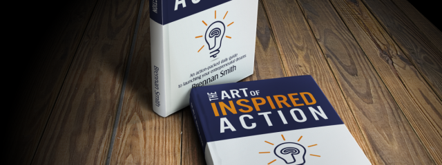
After creating a logo for Inspired Action Network, I was asked to design a front and back cover for a book titled The Art of Inspired Action by Brennan Smith. Target audience for this book are people with issues in productivity & efficiency, who want to achieve and now wants to do something about it. Main request from the client was to keep the cover clean and uncluttered, with fonts having a sense of power and spacing easy on the eyes. It was extremely difficult task for me, as it’s the first real book cover I created. But I enjoyed it a lot, also because of the great collaboration with the author of the book and the rest of the Inspired Action Network Team. As you may see, I decided to divide the cover on upper and bottom part, with a very large main title on the upper part, with a word „inspired” highlighted with a warm orange colour. For the bottom part I created a unique icon of a light bulb, with a coil wire replaced with a shape of the brain, of course to symbolize such aspects like the power of the mind and people having smart ideas. Continue Reading
23majRainbow wave in my logo

Here’s a logo I designed long time ago, which later on I sold via stocklogos.com It’s an abstract logo mark showing a shape similar to letters M and W, connected with each other in a shape of a thin wave. I have no clue who bought this logo, as the buyer remained anonymous, but I hope this logo is being used in an interesting way. Continue Reading
21majLogo for Inspired Action Network

I have had no time recently to update my website, but finally it’s time to show some projects completed in April and May. At first I’d like to present logo designed for Inspired Action Network. They are US-based consulting team specialized in mission-driven, results-oriented leadership training and collaboration enhancement for teams in the environmental non-profit sectors, and foreign affairs-related government agencies. They were looking for the design, which represents harmony between the cold, linear, modern themes that speak of the future and the warm, curvy, sympathetic feel of relationships. I decided to focus on the aspect of the growth, so important in leadership skills and also highly linked with any business venture. That’s why my logo shows a dynamic abstract shape, which combines cooler colours (blue / green) with an arrow-like shape in a warm orange colours.Continue Reading