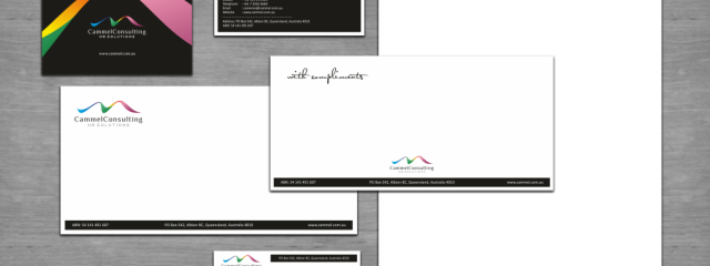
After designing a logo, I was asked to prepare a stationery set for Cammel Consulting from Australia. They provide Human Resource management consulting services primarily to remote location mine sites in the Asia Pacific Region. This also includes recruitment services, performance management advice, remuneration, employee relations advice and mentoring. Final version is quite simple, as this was requested by my client.Continue Reading
ArchivesPosts Tagged ‘letterhead’
10lutBranding for AudioNoggin

I’m really proud of this project. Few weeks ago I was offered to do the branding for a startup company from USA, which is going to produce wireless bluetooth audio devices for helmets and hats. I accepted it right away as very seldom I have a chance to design a logo which later on is used at products or packaging.
The company is called AudioNoggin and is located in California, USA. As a point of background information I was told that in north american slang „Noggin” is for „Head” or „Brain”. It took me really quite some time to come up with ideas and I spent a lot of time on making hand-sketches which were somehow linked with my main ideas: head, helmet, wireless, letter „a”. I was really happy when one of my concepts was chosen by a client for further adjustments.
I think in this logo I managed to capture all key elements, as by retransforming a futuristic looking letter „a” I also showed a head in a helmet which at the same time symbolizes a wireless functions of the product. One of main advantages of this graphics is a possibility to scale it down when it will be applied on the product, which will be really small, as helmet-mounted speakers will be less than 2cm.
After completing a logo project I also designed business cards, letterhead, envelope and shipping labels.
Now I can only wish this product will be successfully launched on the market, as I can’t wait to see it implemented.Continue Reading
08lutVisual identity for nextGENweb

One of the clients for whom I worked in December, came back to me with a new project in January. This time client asked me to prepare full visual identity for his new start-up company – nextGENweb. This company is going to provide high quality web design, branding, e-commerce services and solutions to business across the UK. I was given very few information at the start, but most important for a client was to get a simple logo, which communicates 3 things: Creative, Modern, Fresh. As project’s brief was not really specific, I had to prepare various concepts and one of them grabbed an attention of my client. When logo was finalized & approved, then my next task was to design a look of letterhead, envelope and compliment slips. Here you may see the final result.Continue Reading

