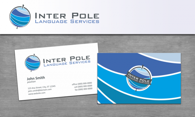
Here’s a first project I would like to share, out of these which I have completed so far in January. Logo was designed for Inter Pole Language Services, a firm providing professional translation & copy-writing services. Together with client we discussed and explored a couple of ideas and ways of presenting it in a vector graphic. Most important for client was to capture two ideas in her new logo: a combination of a globe with an accent put on poles, which is a reference to a global scope of activity of this new company, but also to a nationality of an owner, as she comes from Poland. I didn’t want to make it too obvious, so my final concept was a bit abstract interpretation of client’s idea. To make that logo less static, globe is tilted on its axis. Logo was finalized in two versions: a graphic with firm’s name put across the globe and a graphic without text on it. You can see it better on the second file, where I showed also simple business card I prepared next to a logo.


