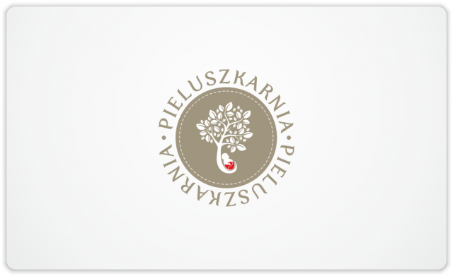
Here’s a logo which I’m very proud of. It gave me a lot of fun during the work on that project. I had a pleasure to cooperate with very open and friendly business owners of Pieluszkarnia, who supported me by providing a constructive feedback, which was extremely helpful to complete this assignment with a success. This logo was created for an online store selling baby products, mainly natural eco-friendly diapers. During the design process I made a multiple variants, based on various ideas. At the end customers decided to use a concept of a leafy tree combined with a little baby in a colourful diaper. Two versions of logo were created: a round version with text circling the graphical element and an oval version with graphical element incorporated into the name of the online store. Both logos look like a patch, as there’s a sewing thread added as a border. I hope this logo will be soon used at the website of Pieluszkarnia.
Here’s a round version
Here are some other concepts made earlier on for owners of Pieluszkarnia
